#responsive flexbox layout
Explore tagged Tumblr posts
Visit Tumblr Blog
Explore Tumblr blogs with no restrictions, modern design and the best experience.
Last Seen Tumblr Blogs


Fun Fact
Tumblr has 4 main sources of revenue.
Text
Web Design with Flexbox
#web design with flexbox#responsive flexbox layout#flexbox tutorial#css flexbox examples#html css#divinector#css#frontenddevelopment#webdesign#html#css3#responsive web design#css flexbox
0 notes
Text
Responsive Neumorphism Service Section
#service section design#dark neumorphism#css neumorphism#responsive web design#html css#codingflicks#learn to code#code#frontend#html#css#css3#frontenddevelopment#webdesign#css flexbox layout#css flexbox grid
5 notes
·
View notes
Text
La propiedad display en CSS: Desde lo básico a los diseños más avanzados.
La propiedad display determina el tipo de caja que un elemento forma y cómo se comporta dentro del flujo del documento. En otras palabras, indica si un elemento se mostrará como un bloque, una línea o si se ocultará por completo. Valores de la propiedad display La propiedad display admite varios valores, cada uno con un comportamiento específico: Valores básicos: block: Crea un bloque que…
#block#caja#contenedor#CSS#CSS3#desarrollo web frontend#Diseño web#diseño web adaptable#diseño web moderno#elemento#elementos HTML#Flexbox#flujo del documento#Grid#inline#inline-block#layout#maquetación#posicionamiento de elementos#propiedad display#responsive design#tipos de display#valor display
0 notes
Text
Responsive Layouts: Flex, Grid and Multi-Column
Responsive Layouts: Flex, Grid and Multi-Column
Welcome to the book “Responsive Layouts: Flex, Grid and Multi-Column” In this book I explain the three best-known responsive layouts: the Flexbox, the Grid and the Multi-Column layout. Flexbox is a one-dimensional layout that only works in one dimension at a time, either horizontally or vertically. The grid layout is a two-dimensional layout that distributes the elements horizontally and vertically at the same time. The multi-column layout is a special layout for magazines and newspapers, where the text should flow in columns with spacing, rules, etc. I'll explain all the properties and their values and how they affect the distribution of elements on the screen. So let's get started.

#css#css3#flex#gird#flexbox#flexible#responsive design#responsive layout#modern layouts#mobile first
0 notes
Text
YOU MUST MAKE A WEBSITE
Oh wow, look at that! YET ANOTHER post urging you to make a webbed site! What a completely new thing that people haven't made a thousand masterposts for already!!
• Making a website might look scary. It is Not.
At first, I too thought making a website was too much work. It really isn't! It turns out that all you need is
an HTML file,
a web hosting service and
w3schools tutorials,
and that's about it!
This post will point you towards these resources, and others I found useful while figuring out how to make a website.
• VERY QUICK EXPLANATIONS:
What's HTML and CSS?
HTML is the content of your webpage, the skeleton of it. What shows up in a webpage is what's written in the HTML file!
CSS is the way the HTML is styled; the colour of the background and the letters, the size of elements, the font, all that!
Do I absolutely NEED JavaScript for a website?
Not at all! You don't need to worry about learning it before getting started.
• What do I make a website for? What do I put in there?
ANYTHING AND ALMOST EVERYTHING. Here's some ideas for pages from a post of mine were I was very normal about websites:
You can make a page that's only pictures of your pets.
You can make an interactive adventure.
You can make your own academic blog full of your own essays or articles.
You can just post a ton of art or make a full music page.
You can make a blog and infodump eternally, give book reccs and reviews. You can host a thousand virtual pets and nothing else.
Upload entire books in a single html file. Make a wikipedia for your ocs. Make a fake site for a random fictional place (restaurant, hotel, whatever). You can make a thousand fanpages/shrines about your favorite media. You can upload your own webcomic and make it all like a fancy website and shit.
I could keep going but, for the sake of "brevity", I won't.
• WEBSITE EXAMPLES!
If I started listing the websites I know, this post would be bottomless. Here's only seven:
https://publictransit.neocities.org/ - A webbed site, for sure
https://ribo.zone/ - A personal site
https://leusyth.neocities.org/ - An art archive
https://solaria.neocities.org/ - Personal website with A Lot of stuff (it'll come up in a bit, because it offers web making resources)
https://hog.neocities.org/ - The Hogsite
https://thegardenofmadeline.neocities.org/ - Another personal site! It also has a web resources page and has made another masterpost like this one (but better)
https://spiders.neocities.org/ - My own website, which must be weird to see in mobile . sorry
• You've convinced me. I want a webbed site. Where do I start?
https://neocities.org/
FIRST OF ALL: Neocities. It is a free web hosting service, and it's the one I and the sites I linked use!
When I first started, my website was a black page with red letters and a drawing, and nothing else! It was like that for a month, till i started picking up on how to do things.
Here's what helped me get an idea of how to make things work:
https://sadgrl.online/learn/articles/beginners-guide-neocities
An absolute beginners guide to neocities -- while when you make an account there you get a tutorial page from the site, this one's extra support for that.
https://www.w3schools.com/
Learn HTML, CSS, JavaScript and MANY other coding things for free. All the tutorial/reference pages have live testing windows for you to mess with!! helped me a LOT while figuring this stuff out!
https://htmlcheatsheet.com/
https://htmlcheatsheet.com/css/
Cheatsheets for HTML and CSS, respectively. It includes a JavaScript one too!
https://sadgrl.online/webmastery/
Sadgrl's webmastery resources! Also includes the next resource listed here:
https://sadgrl.online/projects/layout-builder/
Sadgrl's layout builder; not a lot of customization at a first glance, but I've seen wildly different websites all using it as a base, plus it works using CSS Flexbox, so it generates a responsive layout!
(basically, a responsive layout is one that translates well in different sized screens)
https://www.tumblr.com/fysa/728086939730919424/wikitable-code?source=share
Tumblr user fysa made this layout imitating a wiki page!
https://brackets.io/
At some point, you might want to do things outside the Neocities code editor and get one outside the site. I recommend Brackets, because my old as fuck computer can run that and absolutely nothing else apparently, and it works wonderfully! Though I recommend either turning off the code autocomplete or using it after a good while of already using the Neocities code editor, so you get used to coding on your own.
http://www.unit-conversion.info/texttools/text-to-html/
Turn your text into HTML code! i use this kind of pages for my lengthy blog entries that I don't feel like formatting myself.
https://imagecompressor.com/
COMPRESS YOUR IMAGES.
The heavier an image is, the more your site weighs and the more time your page will spend loading. You don't want that, specially if your site is heavy on graphics. This might help!
https://solaria.neocities.org/guides
Some CSS, JavaScript and Accessibility guides! Worth checking out!
https://eloquentjavascript.net/
This is a free, interactive book for learning JavaScript! NOTE: It is very intuitive, but JavaScript is HARD!! I still haven't learned much of it, and my website does fine without so don't worry if you end up not doing much with it. It's still useful + the exercises are fun.
And now, accessories!
• Silly stuff for your page :]
https://gifypet.neocities.org/
Make a virtual pet, copy the code and paste it in your HTML file! You'll get a little guy in your webbed site :]
https://www.wikplayer.com/
Music player for your website!
http://www.mf2fm.com/rv/
JavaScript silly effects for your site :]
https://blinkies.neocities.org/geoblinkies
Blinkie search engine!
https://www.cbox.ws/
Add a chatbox to your site!!
https://momg.neocities.org/
Infinite gallery of gifs. i've spent hours in there looking at moving pictures and out of them all, the ONLY gif i actually ended up using on my site was a rotating tomato slice. it is still there. trapped.
https://wrender.neocities.org/tarotinstructions
A widget that gives you a random tarot card!
https://www.websudoku.com/widget.php
Sudoku widget!
That's about it for now! I don't know how to end this!!! Remember to have fun and google everything you don't know :]
623 notes
·
View notes
Text
widowbase v3 and v4
Whooboi, there is a lot of discourse going on right now about JCINK coders. Perfect time for me to update some base skins!
For those who just want to streamline their coding process, I have updated my widowbase v3 to include a day/night theme toggle and made a few responsive tweaks to the vertical nav and sidebar. For those looking to learn how to use CSS grid and flexbox to create responsive forum designs, I added a new base, widowbase v4. This version includes some HTML templates that have a very ugly, extremely basic, but functional fluid grid layout. These templates also incorporate hidden divs (read as, display: none) that include the PHP variables frequently used inside those respective HTML templates, so you can easily delete everything I've done and start from scratch with your own. Then just delete the hidden div when you've used everything you need. Easy peasy!
For those of you just beginning your coding journey, I wish you the best of luck! It is such a fun and rewarding hobby. You are also free to rip apart any of the codes on my preview site and cobble them back together. These experiments can be a great learning tool! You are more than welcome to use any of my free resources as a base, as long as the finished product remains free. As for my actual skin bases (or template sets specifically labeled as bases), these can be used for free or paid skins. Make money or give it away, whatever works for you, just leave the credits given to resources intact so others can find out how to accomplish the same thing!
41 notes
·
View notes
Text
Learn HTML and CSS: A Comprehensive Guide for Beginners
Introduction to HTML and CSS
HTML (HyperText Markup Language) and CSS (Cascading Style Sheets) are the core technologies for creating web pages. HTML provides the structure of the page, while CSS defines its style and layout. This guide aims to equip beginners with the essential knowledge to start building and designing web pages.
Why Learn HTML and CSS?
HTML and CSS are fundamental skills for web development. Whether you're looking to create personal websites, start a career in web development, or enhance your current skill set, understanding these technologies is crucial. They form the basis for more advanced languages and frameworks like JavaScript, React, and Angular.
Getting Started with HTML and CSS
To get started, you need a text editor and a web browser. Popular text editors include Visual Studio Code, Sublime Text, and Atom. Browsers like Google Chrome, Firefox, and Safari are excellent for viewing and testing your web pages.
Basic HTML Structure
HTML documents have a basic structure composed of various elements and tags. Here’s a simple example:
html
Copy code
<!DOCTYPE html>
<html>
<head>
<title>My First Web Page</title>
<link rel="stylesheet" type="text/css" href="styles.css">
</head>
<body>
<h1>Welcome to My Web Page</h1>
<p>This is a paragraph of text on my web page.</p>
</body>
</html>
: Declares the document type and HTML version.
: The root element of an HTML page.
: Contains meta-information about the document.
: Connects the HTML to an external CSS file.
: Contains the content of the web page.
Essential HTML Tags
HTML uses various tags to define different parts of a web page:
to : Headings of different levels.
: Paragraph of text.
: Anchor tag for hyperlinks.
: Embeds images.
: Defines divisions or sections.
: Inline container for text.
Creating Your First HTML Page
Follow these steps to create a simple HTML page:
Open your text editor.
Write the basic HTML structure as shown above.
Add a heading with the tag.
Add a paragraph with the tag.
Save the file with a .html extension (e.g., index.html).
Open the file in your web browser to view your web page.
Introduction to CSS
CSS is used to style and layout HTML elements. It can be included within the HTML file using the <style> tag or in a separate .css file linked with the <link> tag.
Basic CSS Syntax
CSS consists of selectors and declarations. Here’s an example:
css
Copy code
h1 {
color: blue;
font-size: 24px;
}
Selector (h1): Specifies the HTML element to be styled.
Declaration Block: Contains one or more declarations, each consisting of a property and a value.
Styling HTML with CSS
To style your HTML elements, you can use different selectors:
Element Selector: Styles all instances of an element.
Class Selector: Styles elements with a specific class.
ID Selector: Styles a single element with a specific ID.
Example:
html
Copy code
<!DOCTYPE html>
<html>
<head>
<title>Styled Page</title>
<link rel="stylesheet" type="text/css" href="styles.css">
</head>
<body>
<h1 class="main-heading">Hello, World!</h1>
<p id="intro">This is an introduction paragraph.</p>
</body>
</html>
In the styles.css file:
css
Copy code
.main-heading {
color: green;
text-align: center;
}
#intro {
font-size: 18px;
color: grey;
}
CSS Layout Techniques
CSS provides several layout techniques to design complex web pages:
Box Model: Defines the structure of an element’s content, padding, border, and margin.
Flexbox: A layout model for arranging items within a container, making it easier to design flexible responsive layouts.
Grid Layout: A two-dimensional layout system for more complex layouts.
Example of Flexbox:
css
Copy code
.container {
display: flex;
justify-content: space-around;
}
.item {
width: 100px;
height: 100px;
background-color: lightblue;
}
Best Practices for Writing HTML and CSS
Semantic HTML: Use HTML tags that describe their meaning clearly (e.g., , , ).
Clean Code: Indent nested elements and use comments for better readability.
Validation: Use tools like the W3C Markup Validation Service to ensure your HTML and CSS are error-free and standards-compliant.
Accessibility: Make sure your website is accessible to all users, including those with disabilities, by using proper HTML tags and attributes.
Free Resources to Learn HTML and CSS
W3Schools: Comprehensive tutorials and references.
MDN Web Docs: Detailed documentation and guides for HTML, CSS, and JavaScript.
Codecademy: Interactive courses on web development.
FreeCodeCamp: Extensive curriculum covering HTML, CSS, and more.
Khan Academy: Lessons on computer programming and web development.
FAQs about Learning HTML and CSS
Q: What is HTML and CSS? A: HTML (HyperText Markup Language) structures web pages, while CSS (Cascading Style Sheets) styles and layouts the web pages.
Q: Why should I learn HTML and CSS? A: Learning HTML and CSS is essential for creating websites, understanding web development frameworks, and progressing to more advanced programming languages.
Q: Do I need prior experience to learn HTML and CSS? A: No prior experience is required. HTML and CSS are beginner-friendly and easy to learn.
Q: How long does it take to learn HTML and CSS? A: The time varies depending on your learning pace. With consistent practice, you can grasp the basics in a few weeks.
Q: Can I create a website using only HTML and CSS? A: Yes, you can create a basic website. For more complex functionality, you'll need to learn JavaScript.
Q: What tools do I need to start learning HTML and CSS? A: You need a text editor (e.g., Visual Studio Code, Sublime Text) and a web browser (e.g., Google Chrome, Firefox).
Q: Are there free resources available to learn HTML and CSS? A: Yes, there are many free resources available online, including W3Schools, MDN Web Docs, Codecademy, FreeCodeCamp, and Khan Academy.
#how to learn html and css#html & css course#html & css tutorial#html and css#html course#html css tutorial#html learn#html learn website#learn html#learn html and css#html and css course#html and css full course#html and css online course#how to learn html and css for beginners
3 notes
·
View notes
Text
Daily Journey : Day 3 and Day 4
Hey Everyone.
Yesterday I was without internet and then without time to post here.
DAY 3:
We learned about selectors, font, color and background, position , flexbox, grid , responsibility, pseudoclasses and animations.
And in the end we were talking about strange tastes.
UHEHUEHUE. Was cool.
+++ I didn't have any negative points that day.
DAY 4:
Yesterday we started with the teacher giving examples of grid and flex.
We did a group exercise with a figma layout.
We have received the first task for delivery.
Negative points:
It was a group of 4 to 6 but just me and two more that we talked a lot. One of them being another woman.
And today, reflecting, I understood how wrong I was in not pulling the other woman in the group in the sense of pulling into conversation. (there were 3 of us) Of course she should speak for herself, but I learned and remembered that I have to make the space more welcoming for other women.
I just got an earful from one of the support guys because I was talking about github. It was just a github project organization tip, not a git lesson. But I lowered my head, after all, if they guide me and I'm wrong, I'll deal with it.
That's it folks.
In the most, I wish who is reading this are well and if they are not, be well.
Have a nice day ou nigth.
#womanintech#codeblr#software development#woman in stem#coding#studyblog#studyblr#software engineering#code#algorithms#apprenticeshipreact#apprenticeship#day_3_and_4#studyspo#college studyblr#study hard#study tips#studyblr community#studystudystudy#studywithme#reblog stuff
10 notes
·
View notes
Text
Responsive vs. Adaptive vs. Neither of those things
Aight so. Big topic. We hear the word 'responsive' a lot when talking about web design but it's kind of a wishy washy topic for lots of people outside tech, especially if you've mostly coded while interacting with jcink. John did it really weird, with two skins- one for mobile, and one for desktop. This is actually pretty convenient because it helps distinguish two ideas. If you go to a website like youtube or even tumblr and resize your window as large as you can and as small as you can. These sites are properly responsive- the layout changes and adapts to the size of the screen. Youtube is (unsurprisingly) better at this than tumblr. It changes to use all of the available screen width at every size, pretty much no matter what. Tumblr (the dash anyway) only expands to a certain size- but it also doesn't break when you make it really small. Now go look at the base jcink skin- jcink support forums for instance. If you look at it on a phone, it'll mostly look okay, and after a certain size, will mostly look okay on desktop too. But there's this whole area between the two where things start to get janky. The fixed sizes of everything start to spill over the window size. That's an adaptive skin. Everything is a fixed size, and which layout you see depends on the type of device you're using. Adaptive sites are generally seen as outdated at this point. Almost no one is coding this way anymore. Now go to a jcink skin. Do the same thing with making your window bigger and smaller. In every skin I've ever seen, *something* will break. Text will overflow, you'll have to scroll from side to side to read a post, images will start to overlap other content. That kind of thing. Some sites will resize to a certain point, but almost none of them will do so all the way down to a mobile size, or even half of a laptop screen. This is neither adaptive nor responsive. THIS IS OKAY. I mean it's not ideal, but almost no one coding for jcink is a professional, and these are legitimately difficult things to get right. You have to be thinking about it from the start of the design process. What's going to happen to that icon when the screen gets small? What about the topic information? How are you going to keep information which looks beautiful at a desktop size looking good at tablet and phone sizes? It's legitimately difficult, and if you're not building with that in mind from the start it's a non-trivial task to make an unresponsive skin responsive. If you want to start thinking about these things, I'd recommend reading about media query breakpoints. For jcink, I think it's fair to code for desktop first (usually it's mobile first today) because people using a jcink site will usually want to be typing in it somewhere. Anecdotally, I think even people who post on mobile usually are writing in a notes app first. My skin worked really well at a 600px breakpoint, but other skins might need different figures. That's okay! As long as you can identify (maybe two) places where your views start to breakdown and have consistent behavior in your css for those breakpoints, you should be fine. I think it's good practice to know what you want your mobile version to look like, and code at least the skeleton of both views as you go, so you don't back yourself into corners. That's already a lot of text, so I'll stop there. I'll follow this up with a few different ways you can approach responsive design beyond breakpoints- grid, flexbox, and percentage based css. I can't really effectively teach these things on tumblr, but I can talk about the pros and cons of each approach so you can start looking into the things that seem like they might fit your use case.
2 notes
·
View notes
Text
Choosing Between Flexbox and Grid for Your Basic Layout Structure

Introduction
Beyond the aesthetics of web design, the choice of layout structure forms the backbone of a project's responsiveness and adaptability. At the heart of this decision lie two powerful CSS tools: Flexbox and Grid. These elements are more than mere design choices; they dictate how a webpage responds to different screen sizes and user interactions, impacting usability and visual appeal.
Understanding the Basics

Flexbox: Flexbox is a one-dimensional layout model best suited for organizing items within a container, offering flexibility in managing space distribution, alignment, and order. Its strength lies in its ability to handle complex layouts while maintaining simplicity in code structure. Grid: Grid is a two-dimensional layout system that creates a grid-based design, allowing precise placement and alignment of elements in rows and columns. Its advantages include fine control over both the rows and columns, making it ideal for overall page structure and layout alignment. Both Flexbox and Grid can be effectively utilized for basic layouts by structuring a header, main content area, and footer with distinct approaches tailored to their strengths.
Comparative Analysis

Flexbox Pros: - Efficient for arranging elements in a single direction, vertically or horizontally. - Great for small-scale layouts like navigation menus or individual components within a page. - Simplified syntax and intuitive approach make it easier to learn and use. Cons: - Complex layouts might require nested flex containers, leading to potential complications. - Challenges in controlling the alignment of both rows and columns simultaneously. Suitable Scenarios: Ideal for smaller, simpler layouts or for organizing elements in one direction, such as in menus or single-axis content layouts. Grid Pros: - Perfect for managing both rows and columns simultaneously, enabling more precise layouts. - Best for complex and multi-dimensional layouts, especially entire page structures. - Offers fine control over placement, making it suitable for responsive designs. Cons: - Complexity in understanding and implementing for beginners due to its comprehensive grid structure. - Not as effective for single-axis layouts compared to Flexbox. Suitable Scenarios: Best suited for larger-scale layouts or designs that demand strict control over both rows and columns, like entire webpage structures or responsive grid systems.
Usage Scenarios

Flexbox Scenarios Where Flexbox Shines: - Small-Scale Components: Flexbox excels in organizing smaller elements within a webpage, like menus, buttons, or individual sections. - Single-Direction Layouts: It's perfect for arranging elements in a single direction, simplifying the structure for one-dimensional layouts. - Mobile-First Designs: Ideal for mobile-responsive designs where content needs to adapt to smaller screens with straightforward layout adjustments. Grid Scenarios Distinct Advantages of Grid: - Full-Page Layouts: Grid is optimal for structuring entire pages, managing complex alignments in multiple directions (rows and columns). - Multi-Dimensional Layouts: Perfect for designs that require precision in both row and column placement, ensuring a cohesive and responsive layout. - Responsive Grid Systems: Offers extensive control for building responsive grid systems that adapt seamlessly across various screen sizes.
Responsiveness and Adaptability
Flexbox and Responsiveness Catering to Responsive Design: Flexbox simplifies responsiveness by allowing elements to adjust based on available space and container size. It facilitates flexible resizing of components within a single direction, aiding in responsive designs. Adaptability in Viewport Sizes: Flexbox is particularly suitable for smaller devices where elements need to flexibly adjust in a single axis, making it easier to adapt content to varying viewport sizes. Grid and Responsiveness Catering to Responsive Design: Grid systems provide a more comprehensive approach to responsiveness by allowing precise control over both rows and columns, enabling intricate adjustments for various screen sizes. Adaptability in Viewport Sizes: Grid excels in handling complex layouts across different viewport sizes, ensuring elements maintain their specified placement and alignment in both axes, enhancing adaptability in various screen sizes.
Best Practices and Recommendations
Choosing Between Flexbox and Grid When to Choose Flexbox: Opt for Flexbox when dealing with simpler, single-direction layouts or smaller components within a webpage. It's ideal for basic layouts requiring flexibility in one axis. When to Choose Grid: Prefer Grid for more complex, multi-dimensional layouts or when structuring entire pages. Choose it when precise control over both rows and columns is necessary. Combining Flexbox and Grid Effective Combination: Consider using Flexbox within specific sections or components within a grid-based layout. For instance, employing Flexbox to organize elements within grid-defined areas can harness the strengths of both techniques. Hybrid Approach: Experiment with combining both Flexbox and Grid to achieve optimal results. For instance, using Flexbox for header and footer elements while implementing Grid for the main content area can leverage the strengths of each method within a single layout.
Real-world Application
Flexbox in Real Projects Project Example: Portfolio Website In a portfolio website, Flexbox was utilized to arrange sections within the main content area. Each project section was organized in a single direction, allowing for easy adaptation to various screen sizes. This choice enhanced responsiveness, especially for mobile devices, providing a seamless browsing experience. Grid in Real Projects Project Example: E-commerce Platform An e-commerce platform used Grid to structure its product listings and category sections. The complex layout demanded precise alignment in both rows and columns, ensuring scalability across different viewport sizes. This choice significantly improved the scalability and responsiveness of the platform, offering a consistent and visually appealing layout.
Conclusion
Flexbox and Grid stand as powerful tools in the realm of web design, each offering distinct advantages based on the nature of the layout and design requirements. Distinguishing Factors: Flexbox excels in simpler, single-direction layouts and smaller components, offering flexibility and ease of use. On the other hand, Grid shines in complex, multi-dimensional layouts, providing precise control over both rows and columns. Significance of Choosing the Right Layout: The choice of layout structure forms the foundation of a project's scalability and responsiveness. A well-thought-out decision between Flexbox and Grid, or a strategic combination of both, is pivotal in ensuring a website's adaptability across various devices and screen sizes. Read the full article
2 notes
·
View notes
Text

Flexbox Website Design
#flexbox website design#responsive layout#responsive website design#css#html css#divinector#webdesign#html#css3#frontenddevelopment#css flexbox examples#flexbox tutorial#flexbox css#flexbox layout
0 notes
Text

CSS Flexbox Responsive Footer
#css flexbox layout#css flexbox footer#codingflicks#html css#frontend#css#html#css3#frontenddevelopment#code#css tricks#responsive footer design#webdesign
0 notes
Text
Propiedades de las Cajas o Bloques en HTML y su Importancia
En HTML, todos los elementos, desde un simple párrafo hasta una imagen compleja, se representan como cajas. Estas cajas tienen propiedades que nos permiten controlar su tamaño, posición, espaciado y otros aspectos visuales. Comprender estas propiedades es fundamental para crear diseños web personalizados y atractivos. ¿Qué es el Modelo de Caja en CSS? El modelo de caja es una representación…
#CSS#css box model#CSS layout#CSS properties#desarrollo web#diseño responsive#Diseño web#Diseño web personalizado#Flexbox#Grid#Guía CSS#HTML#layout#Modelo de caja CSS#Posicionamiento CSS#propiedades CSS#Tutorial CSS#z-index
1 note
·
View note
Text
Responsive Layouts: Flex, Grid & Multi-Column
The hardcover is available in all bookstores. The ebook $6 is only available on the author's website: https://books.abdelfattah-ragab.com

— — — — — — — — — — — — — — — — — — — — — — — — — — -
Join our affiliate program to promote Angular and React courses.
You will only receive money when sales are made, and these should be through your link. Then you will receive 45% commission.
Sign up:
#angular #react #affiliate #commission
0 notes
Text
It's been a while, huh? I've been a bit busy recently with job-hunting, and my RP site recently moved to a new board, so there's been a lot to do there that's held me up on the coding front. When I was finally able to return to coding a week ago, I didn't really have the inspiration to keep coding my previous WIP, the "Drops of Darkness" skin.
But - my old board now isn't being used, and has an entirely new skin, which means the old skin is no longer being used! So, I thought I'd polish it up and see what you guys think!
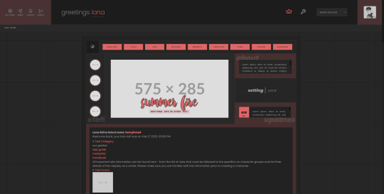
It needs.... some TLC, if I'm being honest. This one doesn't need as much overhauling as my other, older ones did but it was still coded a few *years* ago, back when I was pretty new to the concept of flexbox and grid layouts, and it was mostly duct-taped together behind the scenes with a lot of precise widths and margining that did not lend itself well to being responsive. This go-round, I'm going to fix that, and make it a lot more user friendly.
I'm also adding in some new things to this skin, such as a Dark/Light mode toggle, simpler variables, and a slightly more standardized board layout.
Since this one has been previously used, and it's mostly a passion project to get me back into coding other skins, I'm thinking I'll release this one as F2U or PWYW when I finish dusting it off and welding it back together.
If you have any ideas for requests or features, I'd love to hear them!
5 notes
·
View notes
Text
Freelance Web Development: Required Skillsets and Certifications
In today's digital world, businesses are prioritizing their online presence more than ever. As a result, the demand for skilled professionals in web development is rapidly growing. Whether you're aiming to become a Freelance Web Developer, a Freelance Web Designer, or a Freelance Website Developer, having the right combination of technical skills and certifications is essential.
This article explores the key skillsets and certifications needed to succeed in freelance web development, especially for professionals in Singapore—a booming hub for tech innovation and digital services.
The Growing Importance of Freelance Web Development
The rise of digital marketing, e-commerce, and mobile apps has created countless opportunities for freelancers. Businesses are increasingly turning to Freelance Website Designers and Freelance Web Developers to build modern, scalable, and responsive websites.
In tech-savvy regions like Singapore, the demand for top-tier Web Developer Singapore and Website Designer Singapore professionals is especially strong. If you're considering a career in web design Singapore, the time to upskill is now.
Technical Skillsets Every Freelance Web Developer Needs
1. HTML & CSS
These are the fundamental building blocks of web development. HTML structures the content, while CSS styles it. Any Freelance Web Designer Singapore or Freelance Website Developer Singapore must master these core languages.
2. JavaScript
JavaScript is essential for interactive elements like sliders, pop-ups, and dynamic forms. Proficiency in JavaScript (and frameworks like React or Vue.js) is highly desirable for both Web Designer Singapore and Web Developer Singapore roles.
3. Responsive Design
Websites must perform seamlessly across various devices. Knowing how to build responsive layouts using CSS Grid, Flexbox, or frameworks like Bootstrap is a must for a Freelance Website Designer or Freelance Web Developer Singapore.
4. Version Control (Git & GitHub)
Freelancers often work solo or with teams remotely. Version control systems help manage changes efficiently. Knowledge of Git is crucial for any Freelance Website Developer or Website Developer Singapore.
5. Backend Development
Skills in backend languages such as PHP, Python, Ruby, or Node.js are important for creating dynamic websites. A well-rounded Freelance Web Developer Singapore should be comfortable managing both front-end and back-end operations.
6. Databases
Understanding relational databases like MySQL or PostgreSQL and non-relational databases like MongoDB is important for dynamic data-driven websites. These are vital for any Freelance Website Developer Singapore.
7. Content Management Systems (CMS)
Many clients prefer CMS platforms like WordPress, Joomla, or Drupal for easy content updates. A successful Freelance Website Designer Singapore must know how to develop and customize themes and plugins.
Soft Skills That Make a Difference
Technical skills alone aren’t enough. Freelancers must also possess the following soft skills:
1. Communication
Clear communication helps align expectations and avoid misunderstandings. Clients prefer working with a Website Designer Singapore who can explain technical concepts in simple terms.
2. Time Management
Handling multiple clients and deadlines requires top-notch time management. Effective planning is key for a Freelance Web Designer juggling different projects.
3. Problem-Solving
Whether debugging a script or dealing with client requests, strong problem-solving skills are crucial for any Freelance Web Developer Singapore.
4. Client Management
Freelancers must learn how to handle contracts, invoices, and project updates professionally. A polished, business-minded approach adds credibility to your web design Singapore services.
In-Demand Certifications for Freelance Web Developers
Certifications serve as proof of your skills and commitment to continuous learning. They can also help you stand out in competitive markets like Singapore.
1. Google UX Design Professional Certificate
Offered via Coursera, this certification is excellent for Freelance Web Designers focusing on user experience. It covers wireframes, prototypes, and user testing.
2. freeCodeCamp Certifications
Free and comprehensive, these certifications include Front-End Development, Responsive Web Design, JavaScript Algorithms, and more. Ideal for Freelance Web Developers on a budget.
3. W3C Front-End Web Developer Certificate
This certification, offered in partnership with edX, is ideal for those who want credibility as a Freelance Website Developer Singapore. It covers HTML5, CSS, and JavaScript fundamentals.
4. Meta Front-End or Back-End Developer Certificates
Meta (formerly Facebook) offers highly respected certificates through Coursera. These are valuable for Web Developer Singapore professionals aiming to boost their technical profile.
5. Microsoft Certified: Azure Fundamentals
If you want to work with cloud-based web hosting or app deployment, this certification is a strong asset for Website Developer Singapore freelancers.
6. AWS Certified Cloud Practitioner
For freelancers dealing with scalable web solutions, AWS knowledge is increasingly in demand. This certification adds significant weight to your portfolio.
7. Adobe Certified Professional: Web Authoring
Ideal for Freelance Website Designers who work with Adobe Dreamweaver and Creative Cloud tools. It certifies your ability to design and maintain professional-quality websites.
Specialized Skillsets for Singapore-Based Freelancers
1. Localization & Multilingual Websites
Clients in Singapore often target diverse audiences. Skills in creating multi-language websites (including Mandarin, Malay, and Tamil support) can boost your appeal as a Freelance Website Designer Singapore.
2. Understanding Local SEO
Being proficient in local SEO helps your clients get noticed online. This is essential for a Freelance Web Developer Singapore targeting small businesses.
3. Data Privacy & PDPA Compliance
Familiarity with Singapore's Personal Data Protection Act (PDPA) is a bonus. Clients trust Website Developer Singapore professionals who prioritize legal compliance and data security.
Freelance Tools to Master
The right tools can significantly enhance productivity. Here are a few tools every Freelance Web Designer Singapore or Web Developer Singapore should know:
Visual Studio Code – Lightweight and powerful code editor.
Figma / Adobe XD – For UI/UX design.
Trello / Asana – Project management.
Slack / Zoom – Client communication.
Canva – Basic graphic design for non-designers.
Mastering these tools adds to your capabilities as a top-performing Freelance Website Developer or Web Designer Singapore.
How to Showcase Your Skills
1. Build an Impressive Portfolio
Include case studies that highlight problem-solving, design thinking, and measurable results. A strong portfolio is a must for any Freelance Web Designer Singapore.
2. Create a Professional Website
Your own website should demonstrate your design and development capabilities. It’s your digital business card—especially important for standing out in the web design Singapore scene.
3. Get Testimonials and Reviews
Positive feedback builds trust. Ask past clients to leave testimonials that you can feature on your site. This is highly effective for Freelance Web Developer Singapore professionals building a reputation.
Conclusion
The freelance web development industry is thriving, offering abundant opportunities for skilled professionals. Whether you're a Freelance Web Designer, Freelance Website Developer, or a Web Developer Singapore, having a solid foundation in both technical and soft skills is crucial.
Additionally, obtaining relevant certifications can validate your expertise and give you a competitive edge, especially in saturated markets like Singapore. The combination of practical experience, verified knowledge, and strong communication will ensure your long-term success in web design Singapore.
For anyone looking to build a successful freelance career, continuous learning and adaptation are key. Start with the basics, earn your certifications, and gradually expand your services. Whether you're a Freelance Web Designer Singapore working on front-end projects or a Freelance Website Developer Singapore managing full-stack solutions, the future is full of possibilities.
Visit https://www.freelancewebdesigner.sg to learn on Website development in Singapore.
#freelance web designer singapore#website developer singapore#web design singapore#web designer singapore#web developer singapore#website designer singapore
0 notes